
And since maximum hit points aren't shown in the party list on the main game screen, a status icon called "Wounded" let's you know if the PC suffered any damage.
*ALL PHYSICAL COPIES ARE SOLD OUT*: REALMS OF QUEST V (Digital version is available)
Moderator: Moderators
Re: Work in progress: REALMS OF QUEST V
Completing the rest of the character sheet didn't take too long to do. I do still have to do an inventory system (to equip and remove items) but since I've done this twice before, I can almost program this again from memory.
That's a pretty souped up Level 1 character. You'll notice that this Lord has "Squire Ken" (NPC) as an ally. Summons/allies now figure as part of each player character's inventory.
And since maximum hit points aren't shown in the party list on the main game screen, a status icon called "Wounded" let's you know if the PC suffered any damage.
"A slave is one who waits for someone to come and free him." -- Ezra Pound

Re: Work in progress: REALMS OF QUEST V
Thanks for the blog-style write-up....
Re: Work in progress: REALMS OF QUEST V
I've been tinkering with Mike's PGM IMPORT and created my own tool to convert the MG file into the Realms 5 11*11 multicolor character format.
The amount of graphics that I plan to use will be enormous (hundreds of images).
Does it look like a castle? It does look better than the image I used with Koala Pad.
The amount of graphics that I plan to use will be enormous (hundreds of images).
"A slave is one who waits for someone to come and free him." -- Ezra Pound
-
tonyrocks
- Vic 20 Hobbyist
- Posts: 118
- Joined: Mon Jan 04, 2016 10:17 pm
- Website: http://www.tonyrocks.com
- Location: Pittsburgh
- Occupation: IBM Watson Engr
Re: Work in progress: REALMS OF QUEST V
wow, that looks brilliant!
-
Ola H
- Vic 20 Enthusiast
- Posts: 172
- Joined: Thu Aug 20, 2015 6:08 pm
- Website: http://www.athleticdesign.se/
- Location: Sweden
Re: Work in progress: REALMS OF QUEST V
Yep, it looks very nice! 64-ish and IMO better than the previous castle image.
Re: Work in progress: REALMS OF QUEST V
Thanks everyone.
I found this image:
... to make an in-game portrait of the GUILD banner where you create and manage the members of your party:
Does it look OK?
I found this image:
"A slave is one who waits for someone to come and free him." -- Ezra Pound
Re: Work in progress: REALMS OF QUEST V
I wish Denial had the image uploading feature back in the day when I made Realms 3 & 4 -- when I read them now it doesn't seem to make sense because I provided a lot of screenshots of my work in progress.beamrider wrote:Thanks for the blog-style write-up....
Hopefully everything goes right and I see this project right through until completion.
"A slave is one who waits for someone to come and free him." -- Ezra Pound
Re: Work in progress: REALMS OF QUEST V
And after a hard day of adventuring, it's always good to have time to relax at the tavern and inn.
"A slave is one who waits for someone to come and free him." -- Ezra Pound
-
majikeyric

- Vic 20 Afficionado
- Posts: 351
- Joined: Fri Oct 24, 2014 2:08 pm
- Website: http://majikeyric.free.fr
- Location: France
Re: Work in progress: REALMS OF QUEST V
Yes it looks much better, it is progressing very well ! Thumbs up ! 
Re: Work in progress: REALMS OF QUEST V
I took some Medieval art based on the Arthurian Holy Grail legend to represent the Holy Temple:
"A slave is one who waits for someone to come and free him." -- Ezra Pound
-
orion70

- VICtalian
- Posts: 4341
- Joined: Thu Feb 02, 2006 4:45 am
- Location: Piacenza, Italy
- Occupation: Biologist
Re: Work in progress: REALMS OF QUEST V
Ghislain, thank you so much for this huge effort. It's really shaping as the definitive masterpiece in VIC RPGs. If I can contribute to this sort of WIP blog, I'd like to point out a couple of observations, from my very personal point of view.
First, text. Is it only my impression, or text windows are a bit too crowded, and a bit confusing? The icons for alignment, sex, race, and class are barely readable compared to simple capitals (e.g., LMHL for lawful male human lord). Using capital letters would help the player reading each character's features at a glance. Also, I know your custom font is great, readable, and "medieval" enough, but it's also contributing to the (my) sense of confusion. For example, lower case "o" and "c" are very similar, upper case "L" looks like a C, etc. I know everyone will booo me here, but I'd rather switch to a more readable font, similar to the "fat" or "war" charsets in this old post from Jeff.
Second - and last - graphics art. Both the castle and the medieval art are great in this setting, but I'd give the whole game more of a coherent design, e.g. giving the whole screen different shades of similar colors (the best IMO being shades of black, brown, orange, yellow, white). This would include the screen border (orange?), and possibly font colors. Moreover, I'd picture a real inn - the inside or the façade - instead of a coat of arms; a picture of a real church and not a glass window, and so on. This would add to the realism of the game: upper left window is what your party is looking at.
I know most of what I suggest is not feasible at this point of your work - just take them as simple suggestions, and believe me when I say I'll be playing this game like hell, whatever final form it will take.
First, text. Is it only my impression, or text windows are a bit too crowded, and a bit confusing? The icons for alignment, sex, race, and class are barely readable compared to simple capitals (e.g., LMHL for lawful male human lord). Using capital letters would help the player reading each character's features at a glance. Also, I know your custom font is great, readable, and "medieval" enough, but it's also contributing to the (my) sense of confusion. For example, lower case "o" and "c" are very similar, upper case "L" looks like a C, etc. I know everyone will booo me here, but I'd rather switch to a more readable font, similar to the "fat" or "war" charsets in this old post from Jeff.
Second - and last
I know most of what I suggest is not feasible at this point of your work - just take them as simple suggestions, and believe me when I say I'll be playing this game like hell, whatever final form it will take
Re: Work in progress: REALMS OF QUEST V
I like the icons -- because only 1 character is needed. How to distinguish between an Elf and an Eldar (there are 16 races) -- you can't use E in this case. To understand what the icons mean, this will be explained in documentation and you can look at the character sheet to see attributes like Sex with it's appropriate icon posted right next to it (see the screenshot of the view character sheet earlier in this thread). Ultima IV used Tolkien runes for text at times, so this is really no different. The purpose is for practicality and creating an RPG atmosphere. There are 10 characters to display, so that is why it might look crowded, but I love it.orion70 wrote:Ghislain, thank you so much for this huge effort. It's really shaping as the definitive masterpiece in VIC RPGs. If I can contribute to this sort of WIP blog, I'd like to point out a couple of observations, from my very personal point of view.
First, text. Is it only my impression, or text windows are a bit too crowded, and a bit confusing? The icons for alignment, sex, race, and class are barely readable compared to simple capitals (e.g., LMHL for lawful male human lord). Using capital letters would help the player reading each character's features at a glance. Also, I know your custom font is great, readable, and "medieval" enough, but it's also contributing to the (my) sense of confusion. For example, lower case "o" and "c" are very similar, upper case "L" looks like a C, etc. I know everyone will booo me here, but I'd rather switch to a more readable font, similar to the "fat" or "war" charsets in this old post from Jeff.
As for the font, I can make minor adjustments to distinguish betwen the C and the L, but I also like it.
The difficulty with the artwork that I choose to put int he upper left display is that I will try out 4-5 images from the web until I find one that looks nice after being PGM IMPORTed. The game will have hundreds of images and so to source all the artwork with a consistent theme or getting a volunteer who will meticulously design the graphics by hand for what I am envisioning would be a lot to ask. And because I like to see my work progress, I need some placeholders.Second - and last
And the coat of arms of the inn was supposed to reprsent a mug of beer
As for colors -- I do like the variety and so if I found something looks better in different colors then that's what I will display the image as. I could just keep using BLACK, ORANGE, LIGHT ORANGE and WHITE for every image, but I would find that it would get boring after a while. As for changing the font and border colors, well these are limited to 8. Using white for the normal text color is what will work best and after some tinkering around, I found that red works best for the border color.
It's good to see passion and enthusiasm, thank you for your comments.I know most of what I suggest is not feasible at this point of your work - just take them as simple suggestions, and believe me when I say I'll be playing this game like hell, whatever final form it will take
Last edited by Ghislain on Tue Feb 21, 2017 4:57 pm, edited 1 time in total.
"A slave is one who waits for someone to come and free him." -- Ezra Pound
Re: Work in progress: REALMS OF QUEST V
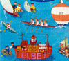
A weaponsmith greets you at Bolzaim's Trading Post.
"A slave is one who waits for someone to come and free him." -- Ezra Pound
-
tonyrocks
- Vic 20 Hobbyist
- Posts: 118
- Joined: Mon Jan 04, 2016 10:17 pm
- Website: http://www.tonyrocks.com
- Location: Pittsburgh
- Occupation: IBM Watson Engr
Re: Work in progress: REALMS OF QUEST V
very nice! Hey, can I be a model for one of the characters? HEHE. I give you permission to use my avatar.

Re: Work in progress: REALMS OF QUEST V
That could be a fun idea, have people from denial donate pics for npc graphics.tonyrocks wrote:very nice! Hey, can I be a model for one of the characters? HEHE. I give you permission to use my avatar.
Graphics are looking awesome so far. I can't wait to see this game in action.
R'zo
I do not believe in obsolete...
I do not believe in obsolete...